What is Chromotherapy?
Chromotherapy is a therapeutic practice that uses colors to balance the body and mind. Based on the idea that colors can affect our emotional, physical, and spiritual well-being, this technique is used to promote healing and harmony. Each color has a unique vibration, and when applied intentionally, it can influence our emotional state and even improve our health. While chromotherapy is most commonly known in the context of health and wellness, it also has a strong connection to the world of visual arts.
The Concept of Chromotherapy in Visual Arts
In the visual arts, chromotherapy goes beyond the aesthetic use of colors. It involves choosing color palettes with the intention of evoking specific emotions and creating a profound sensory experience for the viewer. Painters, sculptors, and designers have known for centuries that colors are not just decorative elements but powerful tools that can influence emotional and psychological states. Chromotherapy in artistic creation is, therefore, a way to heal and transform perception through art.
How Colors Influence Emotions in Art
Each color carries an emotional charge that can deeply affect those who observe it. For example, warm colors like red and orange are often associated with energy, passion, and even anxiety, while cool colors like blue and green evoke feelings of tranquility, serenity, and introspection. The careful choice of colors can transform a piece of art into a powerful emotional communication tool.
In painting, the use of a balanced palette can enhance the visual impact of a work and influence the viewer’s perception. Color, then, is not only an aesthetic choice but also a way to guide the viewer through an emotional journey. By understanding the relationship between colors and emotions, artists can create works that not only convey a visual message but also heal and connect with the audience on a deeper level.
The Science Behind Chromotherapy in Painting
Chromotherapy is grounded in scientific principles involving color psychology and the physics of light. When light of different wavelengths enters our eyes, it triggers chemical reactions in the brain, affecting our emotional state. For example, red light has a longer wavelength and is associated with action and excitement, while blue light, with a shorter wavelength, has a calming and relaxing effect.
Studies show that colors can increase the production of hormones like serotonin, which is responsible for the feeling of well-being, and reduce cortisol levels, the stress hormone. Therefore, by using colors strategically in a piece of art, the artist can influence not only the visual perception but also the emotional state of the viewer, creating a deeper and more healing connection.
Exploring Specific Colors and Their Therapeutic Effects
Each color has its own distinct meaning and emotional effect, and can therefore be used to achieve different therapeutic goals. Here are some examples:
- Red: Associated with energy, passion, and action, red is an intense color that can stimulate adrenaline and create a sense of urgency or excitement. In art, it can be used to convey strong emotions like anger or love.
- Blue: This color is linked to tranquility, serenity, and peace. Blue can have a calming effect, reducing anxiety and providing a sense of comfort. In artworks, it is often used to create a relaxing atmosphere.
- Yellow: The color of optimism, clear thinking, and creativity, yellow can inspire joy and mental clarity. Used in moderation, it can brighten a piece and evoke feelings of happiness.
- Green: Associated with balance, health, and nature, green conveys a sense of renewal and healing. In paintings, it is ideal for creating calming and reflective environments.
- Purple: Purple is often associated with spirituality and introspection. It is a mysterious color linked to transformation and self-awareness. It can be used to evoke emotional depth and contemplation.
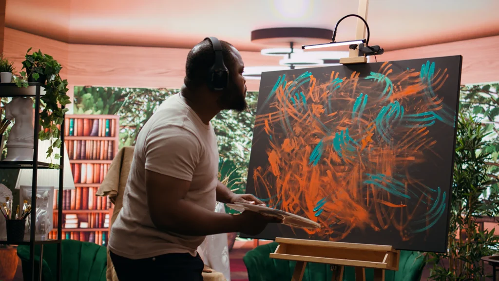
- Orange: A color that combines the energy of red with the joy of yellow, orange is frequently associated with creativity, enthusiasm, and warmth.
Each of these colors can be used to set a specific tone in a piece of art, influencing how the viewer feels when interacting with it. By understanding chromotherapy, the artist can harness the power of these colors to create a unique and emotional experience.
How to Apply Chromotherapy in Artistic Creation
Applying chromotherapy in art begins with understanding how colors function emotionally and psychologically. Here are some practical tips for integrating chromotherapy into your artistic creation:
- Define the emotional intention of the piece: Before starting, think about what you want the viewer to feel when observing your art. If you want to evoke peace, use shades of blue and green. For excitement, opt for red and orange.
- Balance the colors: Not all artwork needs to be vibrant. Sometimes a balanced combination of colors can have a deeper emotional impact. Using contrasts can also intensify the emotional response.
- Experiment with different combinations: Don’t be afraid to explore new color combinations. Sometimes, unexpected colors can result in surprising effects. Experimentation is key to discovering what works best for your artistic style.
- Use colors symbolically: Each color has a symbolic charge, so use them in a way that aligns with the message of your artwork. For example, painting a scene of tranquility with soft blue and green hues can communicate a sense of peace and calm.
Examples of Artists Who Used Chromotherapy
Many artists throughout history have used chromotherapy consciously or intuitively to convey emotions and influence the viewer. A notable example is Wassily Kandinsky, whose abstract works used vibrant colors to explore the relationship between emotion and color. Kandinsky believed that art should be a sensory experience that engages both the spirit and the senses.
Another example is Mark Rothko, whose minimalist paintings of large fields of color are designed to envelop the viewer in an emotional experience. Rothko used color to create an intense, meditative atmosphere, aiming to provoke a deep emotional response from the observer.
These artists and many others have demonstrated how colors can be used effectively to manipulate emotional states and provide a healing experience for the audience.
Unleashing the Healing Power of Colors in Your Art
By incorporating the principles of chromotherapy into your art, you not only create visually stunning pieces, but you can also impact the emotional well-being of those who view them. Art, when combined with the power of color, becomes a powerful tool for healing, transformation, and emotional connection. So, explore colors, experiment with different combinations, and let your art become a sensory and healing experience for both you and your audience.